Bitget Rebrand
The story behind

Brand logo before 2023
Since 2022, Bitget has been playing a stronger role in the global crypto community. We initiated the development of a brand for our platform through an external website, as well as on social media platforms such as Twitter and Instagram. Additionally, we organized various engaging events.
“Assets for our products, presentations, social media, and in-person events were being created by different teams, leading to some confusion in interpreting our design guidelines."
We could see that our designers craved a more flexible, playful system that would allow them to tell stories, explore big innovation, and energize our community.
What we want to achieve
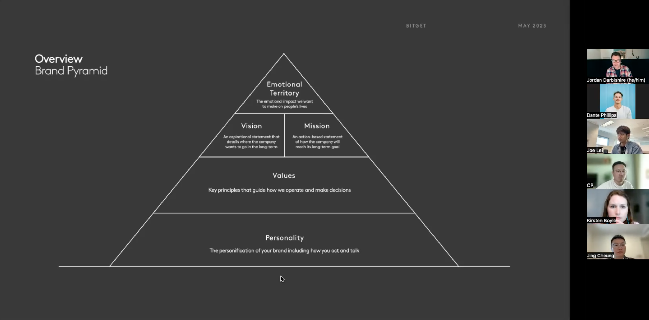
We need values, vision, and a mission that align with our future growth and more tangibly explain how we deliver on it.
We need to evolve the brand's personality to become more global and human, infused with a touch of attitude.
We need a design system that is distinct, consistent, and better supports the diverse needs of the different business units.
We started anew by approaching the new brand using our product design process—namely, 'think it, build it, ship it, tweak it'—to provide ourselves with structure and communicate our progress effectively with designers using their own language.
Desk Research✍️
Before diving into a fix-it mode, we aimed to define our problem and identify who would help us solve it.
For the initial design exploration, we partnered with the Branding Department to conduct a workshop with top management roles to analyze our strengths and weaknesses.
Brand Foundations
At a glance, we can see all the foundations together and how they are interlinked.


Creative Territories
After establishing the brand foundations, we delved into reference materials, sought inspiration, and reviewed previous design work. Subsequently, we developed several creative territories that aligned with the brand foundations. From these, we narrowed down to a shortlist of three promising territories.
Moodboard
Colour
This route utilizes color to establish a friendly atmosphere by incorporating bright pops of neon alongside muted tones, resulting in a soft yet dynamic color palette.
Typography
To balance the playfulness of this route, we anchor the typography with one Sans Serif font. This allows us to create a usable, functional type language that complements the illustration style and effectively conveys the necessary information to people.

Logo, Type & Color Updates
After aligning on Creative Territories, we've moved into our mid-fidelity sprint. We've redrawn the logo, chosen primary and secondary typefaces, and provided color palette options.


Final logo
Type


Color


Creatives
Utilized in the header banners of our website and for large-scale events involving print, this range of images is ideal for brand-heavy usage. Featuring our signature glass material and orb pattern detail, it forms exquisite and detailed artwork that showcases our quality.


Illustration
Illustration is a critical piece of the Bitget identity, and is an extremely flexible way to express ideas, feelings and to add energy to key brand moments.


Learn moe detial about how we developed our visual system. ➡️

